With a vision of evolving her massage therapy business into an upscale acupuncture and bodywork practice, Nina (Acupuncture) sought my help in designing the branding for the new venture. Hoping to attract new patients while introducing her existing, upper-class clientele to Traditional Chinese Medicine (TCM), the identity needed to convey a sense of luxury and approachability, while also demystifying Eastern medicine. I developed the logo and visual language and I continue to design and consult on ongoing projects.
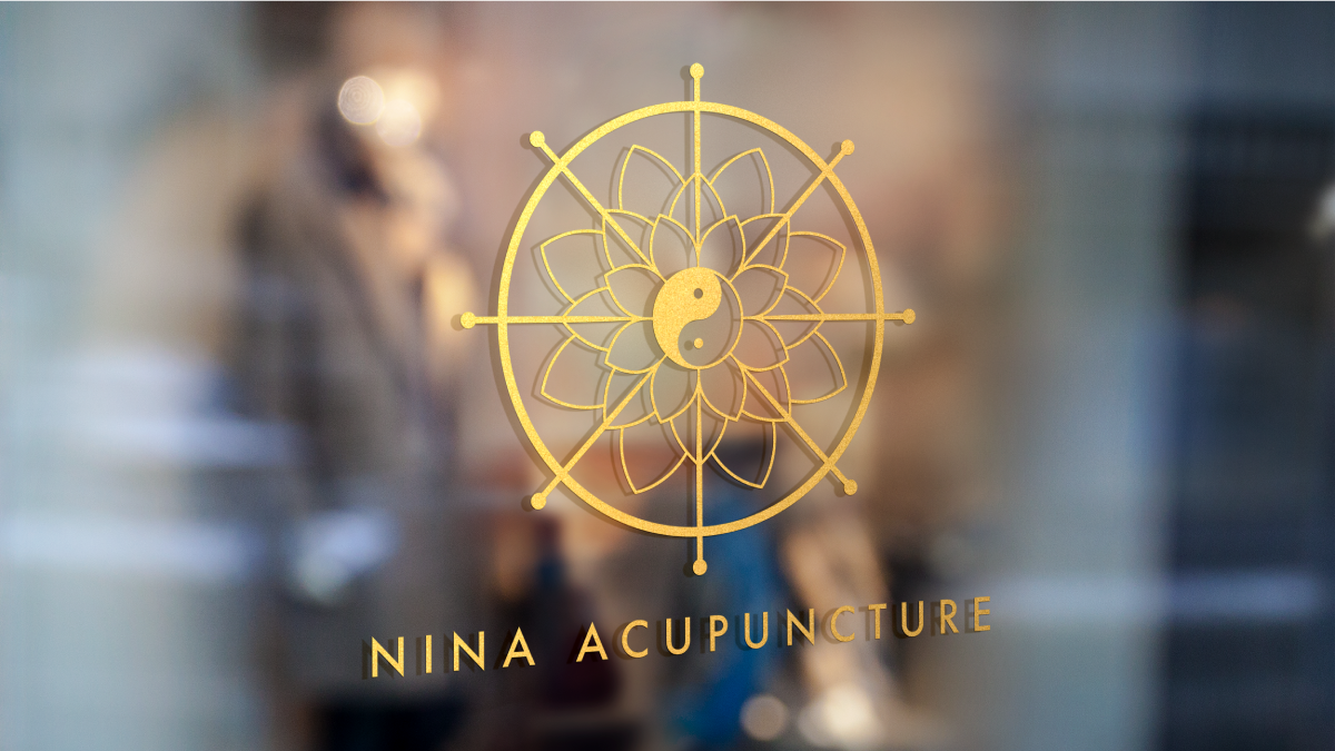
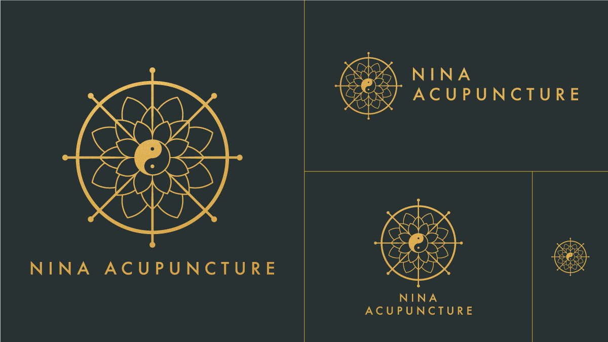
Brand Marks
The primary logo features a wordmark alongside an icon that incorporates Buddhist concepts and elements of TCM, including the dharmachakra, acupuncture needles, lotus flower, and yin and yang symbol.
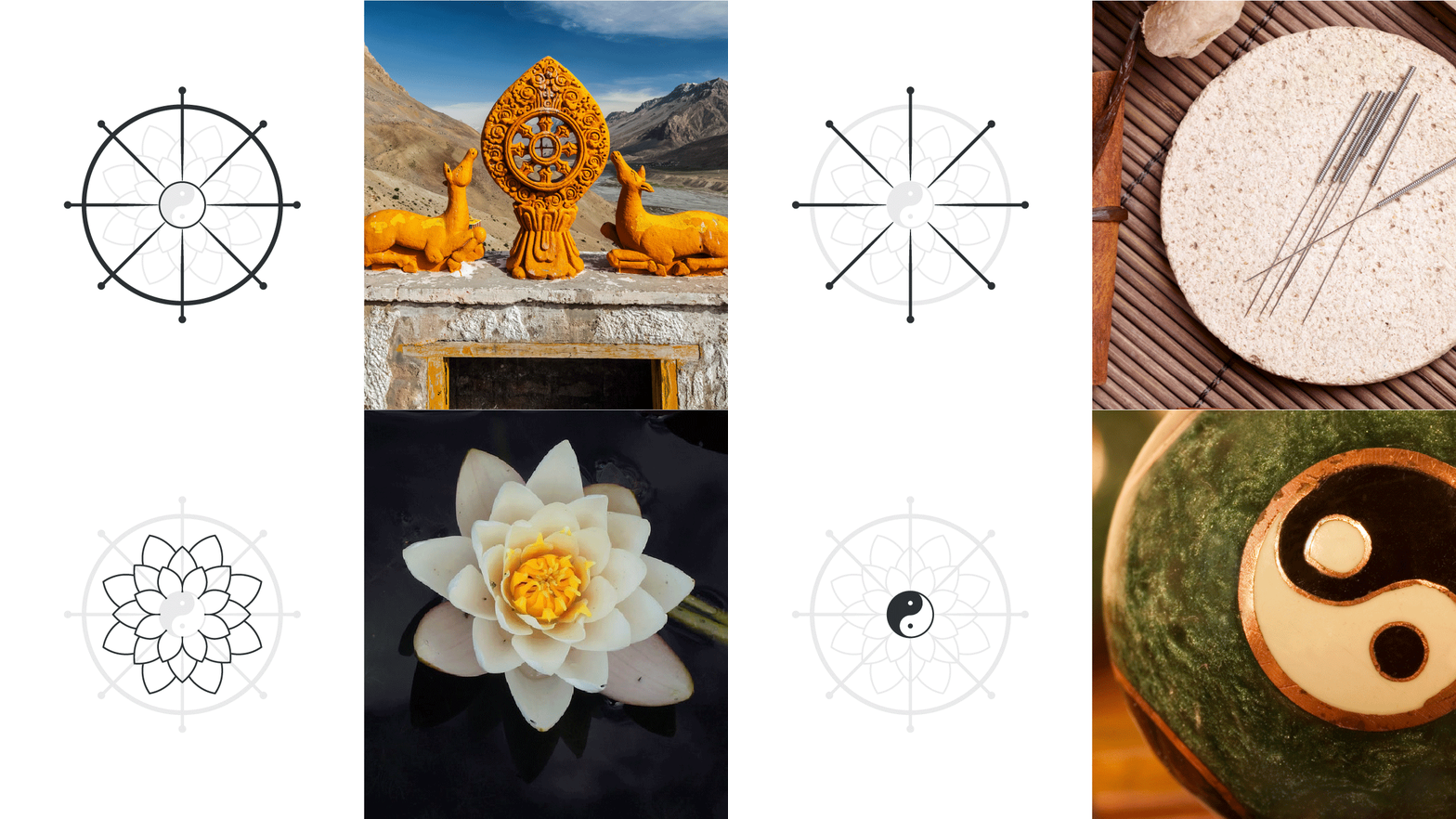
Design Elements
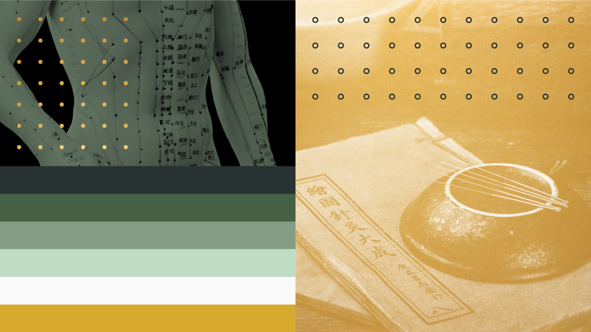
Buddhism and TCM informed the color palette, while acupoint diagrams inspired the dot motif.
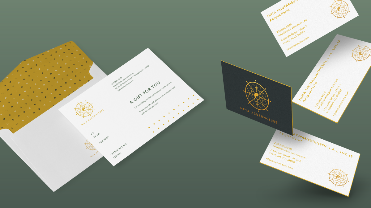
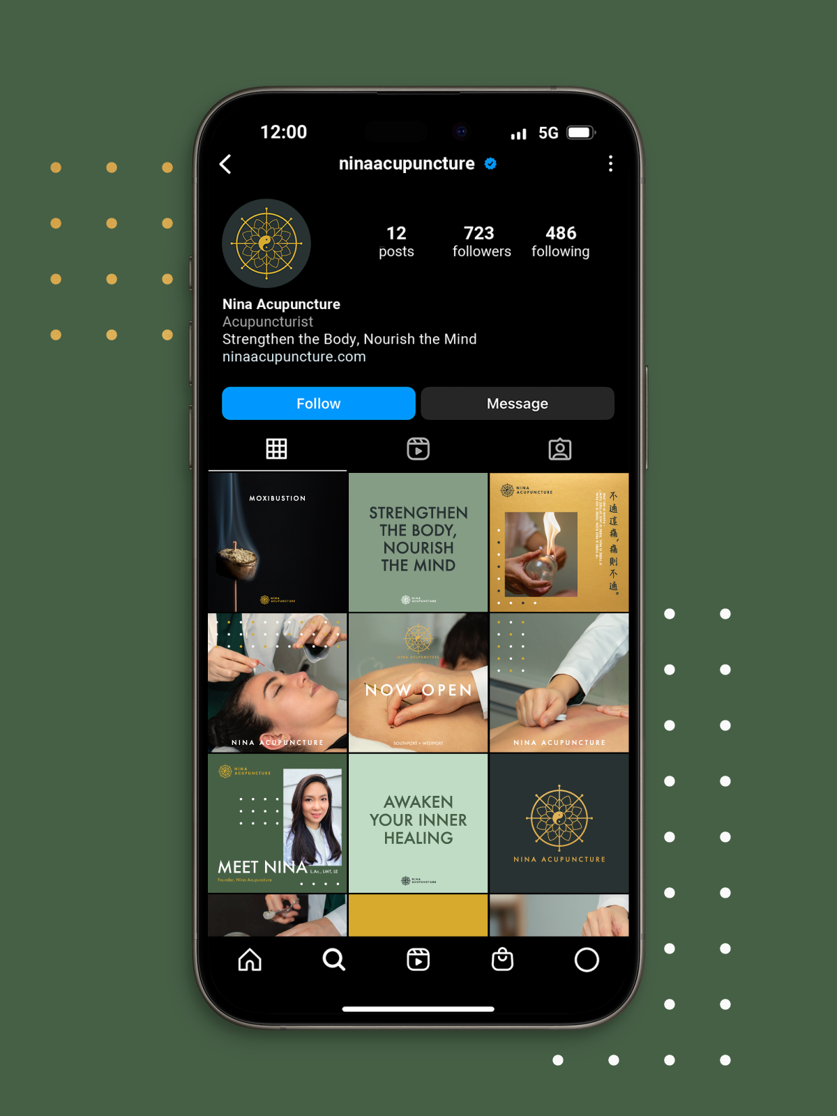
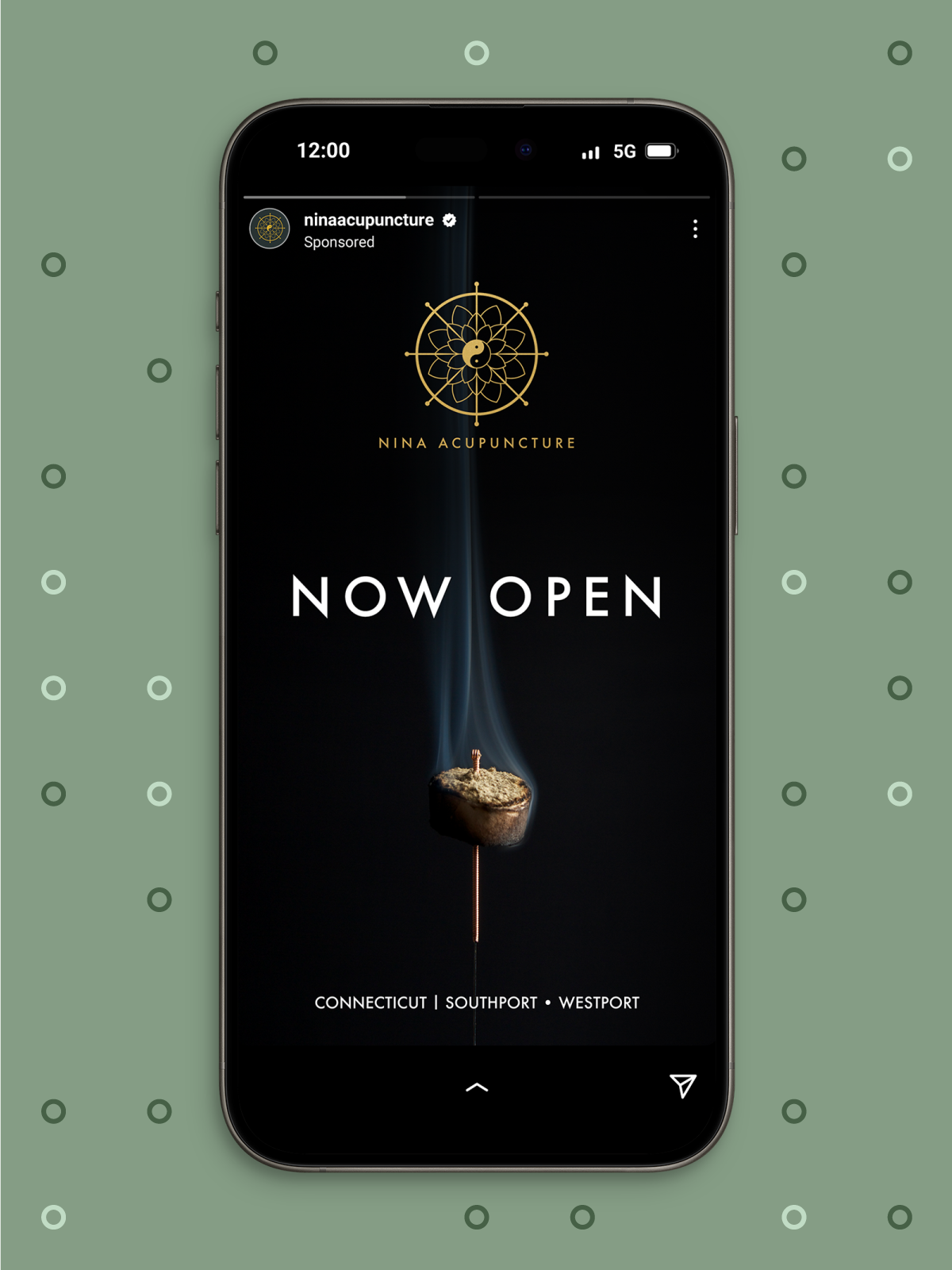
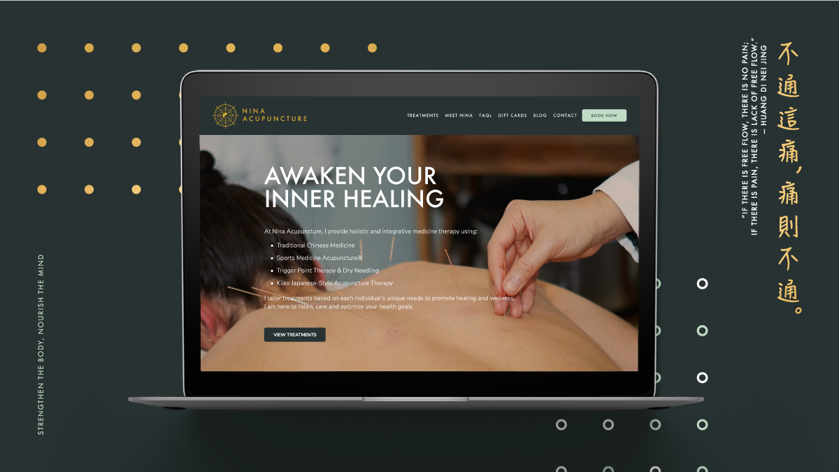
Collateral
Roles: Creative Director + Designer

